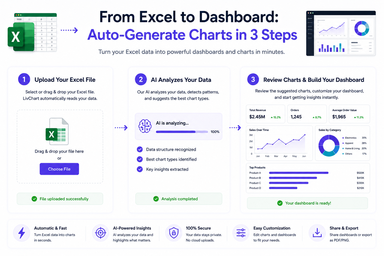
Most business data lives in Excel files.
But turning those spreadsheets into visual dashboards usually requires coding, expensive tools, or hours of manual work.
LivChart makes this process automatic.
From Spreadsheet to Dashboard in Minutes
The gap between spreadsheet data and visual dashboards is one of the biggest bottlenecks in business analytics.
Teams collect data in Excel. They store KPIs in spreadsheets. They track operations in CSV files.
But getting that data into a visual format that supports decision-making traditionally requires:
- BI expertise to design dashboards
- SQL knowledge to query data
- manual chart creation for each metric
- ongoing maintenance as data changes
LivChart eliminates these barriers with AI-assisted dashboard creation.
3 Steps to Visualize Your Data
Step 1: Import Your Data
Upload your Excel or CSV file, or connect directly to your SQL database.
LivChart automatically detects:
- column types (dates, numbers, text, categories)
- headers and field names
- data relationships
- potential metrics and dimensions
No manual data modeling required.
Step 2: Describe What You Want
Open the AI Chart Wizard and describe your chart in plain language.
Examples:
- Show me monthly revenue by region
- Compare top 10 products by sales volume
- Visualize production efficiency over time
- Which suppliers have the longest delivery delays?
- Analyze quarterly profit margins by product category
The AI understands your intent and generates the appropriate chart.
Step 3: Refine and Export
Review the generated chart, adjust colors and labels if needed, then add it to your dashboard or export as PDF.
You can also ask follow-up questions:
- Now show me the same data as a line chart
- Filter to only show Q3 data
- Add a comparison with last year
Each adjustment happens conversationally, without rebuilding the entire dashboard.
Supported Data Sources
LivChart connects directly to multiple data formats:
| Source | Auto-Detection | Best For |
|---|---|---|
| Excel (.xlsx, .xls) | Yes | Operational data, reports |
| CSV files | Yes | Exported data, logs |
| SQL Server | Yes | Enterprise databases |
| PostgreSQL | Yes | Application data |
| MySQL | Yes | Web applications |
| ODBC sources | Partial | Legacy systems |
The platform automatically identifies table structures, column types, and relationships to accelerate onboarding.
How AI Chart Wizard Works
The Chart Wizard uses natural language processing to understand what you want and generate the appropriate visualization.
Intent Detection
When you type "show me monthly revenue by region," the AI identifies:
- metric: revenue
- dimension: region
- time grouping: monthly
- chart type: bar chart (inferred)
This semantic understanding means you do not need to know chart types or data modeling terminology.
Smart Chart Selection
The AI selects the most appropriate visualization based on your data and question:
- comparisons → bar charts
- trends over time → line charts
- proportions → pie or donut charts
- distributions → histograms or scatter plots
- geographic data → map visualizations
Conversational Refinement
After generating a chart, you can refine it through conversation:
- Change the chart type
- Add or remove filters
- Adjust date ranges
- Highlight specific segments
- Add comparison periods
All without touching a single configuration dialog.
Why This Matters
Data that stays in spreadsheets is data that never gets acted on.
Visual dashboards transform static numbers into dynamic insights that drive decisions.
Faster Time to Insight
Traditional dashboard creation takes hours or days. LivChart's AI Chart Wizard takes minutes.
This dramatically shortens the cycle from data to decision.
Lower Technical Barrier
Not everyone knows SQL. Not everyone has BI expertise.
Natural language chart creation means business users can create their own visualizations without depending on analysts.
More Data Gets Used
When visualization is easy, more data gets analyzed.
Teams that previously left data in spreadsheets start exploring it visually.
Better Decision-Making
Visual data is easier to understand than spreadsheet rows.
When insights are clearer, decisions are faster and more informed.
Common Use Cases
Sales Analysis
Upload monthly sales data. Ask "show me top products by revenue." Get a chart in seconds.
Inventory Monitoring
Connect your ERP data. Ask "which products are approaching low stock levels?" Identify reorder needs visually.
Financial Reporting
Import quarterly financials. Ask "compare revenue and expenses by quarter." Generate comparison charts instantly.
Production Analytics
Upload production logs. Ask "visualize downtime by machine." See operational bottlenecks clearly.
Customer Insights
Import customer data. Ask "show customer distribution by region and segment." Understand your customer base visually.
From Static Data to Dynamic Dashboards
Spreadsheets are static. Dashboards are dynamic.
LivChart transforms your static data into interactive dashboards where you can:
- filter and drill down into data
- ask follow-up questions conversationally
- share dashboards with team members
- export reports as PDF
- schedule automatic data refresh
This is not just about visualization. It is about making data accessible and actionable.
Final Thoughts
The gap between spreadsheet data and visual dashboards has been a persistent bottleneck in business analytics.
LivChart's AI Chart Wizard closes this gap by turning natural language descriptions into professional charts in minutes.
No coding. No BI expertise. No manual formatting.
Just describe what you want to see and let the AI do the rest.